For many retailers, this is the time to run summer sales to make space in your store for next season products. It’s also a great time for retailers to review their store set-up and make improvements to be able to maximize their sales potential during the upcoming holiday season. If you plan to refresh your store, make sure you avoid these 5 pitfalls to improve customer experience, reduce theft and sell more!
1) Making customers guess where products are in your store
While this may seem counter-intuitive to the idea of the “treasure hunt” approach that retailers such as Costco have used successfully, it’s important to remember that today’s rushed shoppers don’t have a lot of patience. Shoppers that visit a store, often have an objective in mind. While shoppers may look around after they’ve found what they’re looking for, if it takes them too long to find specific products, they may give up in frustration.
You should always have an overall plan of how traffic will move through your store. For larger retailers, this means having posted store maps, product locators or professional signage visible from the entrance area to help customers quickly find what they need. Smaller stores can hang a bulletin board near the front door (preferably on the right-hand side) with a store map, weekly sale items, events calendar, etc. For staff, it’s “obvious” where products can be found but have you looked at your store layout with “fresh eyes” recently? Do incoming customers frequently ask to locate certain products? If so, it’s likely that your sales staff are spending more time directing customers than selling. Remember that the first 10 seconds a customer is in the store sets the tone for their entire shopping experience. What first impression is your store giving? Review this regularly.
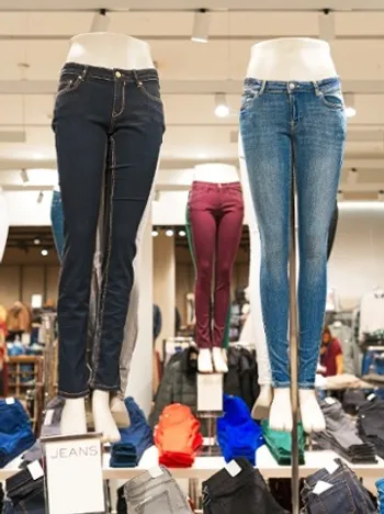
Remember that you don’t have to group products by category. You can group products by brand, by use (e.g. all items related to brewing and drinking coffee) or even by supplier. Many suppliers have products that are meant to be sold together. This is often the case with fashion retailers where suppliers have seasonal lines. You will want to display such products together to have a stronger impact when you start merchandising them.
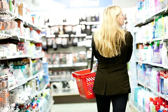
If you have a lot of regular customers, “loss leader” pricing on popular bulky products still works. This is the long-standing in-store pricing tactic whereby certain products are offered for sale below its minimum profit margin – not necessarily below cost – and is intended to “lead” to the subsequent sale of other (ideally higher margin) items. If your store size will allow it, place your loss leader products at the back of the store. If you’re a grocery store, it’s best to use bulky staples such as toilet paper or large soda packs. Place baskets or carts near these items to slow down your customers when they walk to the checkout. Make sure that you train floor staff to get a basket for customers when they are carrying products. Studies have shown that customers spend up to 15 minutes longer in a store and purchase 25% more on impulse buys when their hands are free.
2) Not having a merchandising plan in place
Now that you’ve reviewed your signage and layout, you’re all set right? Unfortunately, you’ve only just begun. Every store needs a retail merchandising plan to increase sell-through. According to industry strategists such as Bob Phibbs, a basic merchandising plan will include the following:
- A department plan that changes with the seasons and holidays.
- A budget for store fixtures, props, lighting, and signage.
- A merchandise planning system which will help maximize turn, limit out-of-stocks, increase margins, and minimize markdowns.
To paraphrase what Nicole Reyhle and Jason Prescott highlight in their industry guide Retail 101, your sales floor and displays require constant reinvention as even great displays will inevitably become stale. Some of the key areas they suggest paying special attention to include:
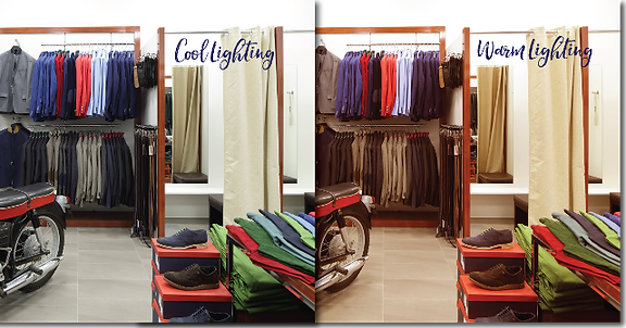
- In-store lighting: The lighting in a store can serve multiple purposes. It can be used to lead customers to certain areas of your store or entice customers to engage with products at key displays. It can also be used in the grey area of fitting room stagecraft exemplified by the use of soft, amber lighting to flatter shoppers.
- Store windows: Storefront windows offer a chance for you to highlight or tell a story with your store inventory. As you can imagine, these are one of the most frequently rotated displays in a retail store. For general retailers, a good rule of thumb is to change up your window displays at least every 2-3 weeks.
- Decompression zone: The immediate zone inside your front entrance is a great location to quickly engage and entice customers to explore further into your store. You don’t want customers to stop too long but it’s an ideal place to highlight new must-have items, special events, store maps, weekly promotions, etc.
- Speed bumps: These are tabletop product displays spread throughout your store to keep customers engaged and, if possible, allow them to interact with the product. Ideally, you will want to have some height with your speed bump and enough products so that customers can pick up or buy products without ruining your display. Naturally, you will not want to include any fragile products in your speed bumps. Also, make sure your speed bumps are not in the decompression zone but start just beyond that area to invite customers to explore further. If you have the budget for it, it’s always a good idea to use accent lighting and display stands with lockable wheels to make it easier for you to move things around frequently without a lot of effort. In Retail 101, it’s recommended that you have about 5 speed bumps for every 500 square feet of retail space.
- Sale section or end features: Whether you have the space for a sale or you have aisles with end features, these areas are meant to display promotional items, not regular merchandise. While some retailers will have a dedicated sale section to move end-of-season products (at the back of the store, naturally), others will use their end features to showcase fun, seasonal wares. Moving a product from its regular shelf location to a featured end cap can increase average sales by up to 25%, so try to switch up your displays at least every two weeks to keep things fresh and customers coming back for more. If you don’t have any new items, even rotating the location of the end features will give regular customers the impression of a treasure hunt to locate your latest promotions, similar to what Costco does in their warehouses.
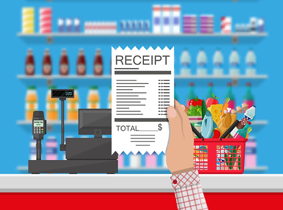
3) Under-utilizing the check-out area
Remember, you will already have a major advantage by the time customers are in this zone. When people are ready to check-out, they have already made the decision to purchase from you! Make sure that you leverage this during check-out by:
- Using the wall behind the check-out area to display new items, bestsellers or high-margin products.
- Making sure store policies are visible and professionally done to show that you stand behind your products.
- Offering small add-on products for customers to peruse while lining up. Keep your impulse products lower in price so that customers don’t need to think much about the decision. Make sure that your selection and pricing reflect your target market and complement your general store assortment.
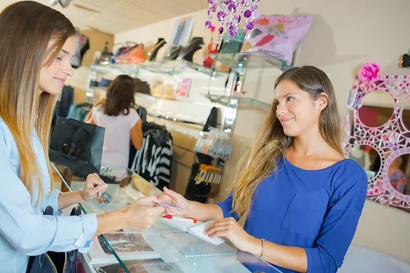
4) Not utilizing mirrors strategically
Mirrors are a great tool in-store to modify perception and change behaviour. Many retailers use them to:
- Improve customer behaviour: Mirror the wall behind your check-out staff so that customers who approach the counter will see themselves. This has been shown to lower the chance of customers being rude or acting irrationally as they can see how their behaviour appears to others.
- Create flattering fitting rooms: While some believe it is misleading, it’s fairly common practice for clothing retailers to install mirrors with a slight outward tilt at the bottom to produce the illusion of appearing longer and leaner.
- Reduce shoplifting: Thieves are less likely to try to steal products if there is a greater chance that they will be seen. Besides digital security systems, smaller businesses can add outward-facing mirrors in strategic locations near high-value products. If you have narrow checkout aisles, add mirrors to ensure that the underside of carts are visible. Remember to be discreet with mirrors at the checkout though. Customers will get the wrong impression if you only install waist-level mirrors behind them!
- Make smaller spaces look larger: This is an age-old design trick used by home-owners that works just as well in retail store design.
5) Not reviewing the performance of your store traffic and displays on a regular basis
In-store merchandising is only as good as its ability to increase sell-through. While there isn’t a right or wrong approach to merchandising, it is definitely something that can be tracked. Make sure that you monitor your inventory levels and sales performance weekly. A good retail point-of-sale system should give you access to well-designed sales and inventory reports so that you can easily track your performance. Not only will this allow you to better manage your stock levels, it will give you greater insight on which tactics are working, who your customers are, how best to plan your staffing and, most importantly, why they are buying from you.
Good Luck and Happy Retailing!
